Redesigning an internal deal flow management app for Lightbox, a $400MM Venture Capital fund based in Mumbai focused on early-stage consumer technology businesses.
MY ROLE
MY ROLE
Product Design,
Design System
Product Design,
Design System

INTRODUCTION
INTRODUCTION
Lightbox is a Mumbai based venture capital firm. They’re constantly on the look-out for the next big investment opportunity.
To manage the flow of potential deals, they use an internal insight and deal flow management app called the Lightbox Gallery.
In 2021, we set out to redesign the Lightbox Gallery app, with an aim to improve employee’s participation in voting for potential deals and also give them a cleaner & more intuitive way of accessing insights and managing their deal flows.

A peek at the redesigned app
A peek at the redesigned app
The previous version of the app was broken down into 4 pages:
The previous version of the app was broken down into 4 pages:
The Gallery
The Gallery
The home page, where users could view pending deals, get spotlight meeting reminders, and view metrics.
The home page, where users could view pending deals, get spotlight meeting reminders, and view metrics.
Vote
Vote
The primary functionality of the app, a section where Lightbox employees (the users) could view pitches and vote for new deals.
The primary functionality of the app, a section where Lightbox employees (the users) could view pitches and vote for new deals.
Signals (News Feed)
Signals (News Feed)
This is where users could read up on the latest articles/ papers to keep themselves up to date with trends in the industry.
This is where users could read up on the latest articles/ papers to keep themselves up to date with trends in the industry.
Metrics
Metrics
Metrics from the industries Lightbox has their eye on as well as statistics from the companies part of their portfolio.
Metrics from the industries Lightbox has their eye on as well as statistics from the companies part of their portfolio.

An overview of the previous version of the app
An overview of the previous version of the app
PROBLEM STATEMENTS
PROBLEM STATEMENTS
How could we improve the deal voting process, making it interactive and give employees an intrinsic motivation to vote?
How would we consolidate, trim and lay out information about various funds/industries into a medium which would help their investment process and build the Lightbox brand?
How could we improve the deal voting process, making it interactive and give employees an intrinsic motivation to vote?
How would we consolidate, trim and lay out information about various funds/industries into a medium which would help their investment process and build the Lightbox brand?
BREAKING DOWN THE PROBLEM
BREAKING DOWN THE PROBLEM
We did an extensive audit and experience review of the previous version of the app, to see where tangible improvements can be made. Along with this, we spoke to employees at the company who revealed some of the issues with the previous version of the app.
We did an extensive audit and experience review of the previous version of the app, to see where tangible improvements can be made. Along with this, we spoke to employees at the company who revealed some of the issues with the previous version of the app.
Lack of consistent visual hierarchy and an outdated UI 📱
Lack of consistent visual hierarchy and an outdated UI 📱
Key sections lacked the visual hierarchy they needed to induce the users to perform the tasks they needed to. Dated UI patterns led to the app being clunky and inconsistent.
Key sections lacked the visual hierarchy they needed to induce the users to perform the tasks they needed to. Dated UI patterns led to the app being clunky and inconsistent.
Difficult to quickly scan, evaluate and vote for new deals 🔍
Difficult to quickly scan, evaluate and vote for new deals 🔍
The interface was cluttered & bloated with information which led to low voting sessions from users on the voting page.
The interface was cluttered & bloated with information which led to low voting sessions from users on the voting page.
Signals and other pages needed feature improvements ✨
Signals and other pages needed feature improvements ✨
Signals had great sources of articles, but lacked an ability to search, sort and sift through a lot of information . Users missed a lot of news, and the app lacked the affordance to discuss and
communicate about insights from Signals.
Signals had great sources of articles, but lacked an ability to search, sort and sift through a lot of information . Users missed a lot of news, and the app lacked the affordance to discuss and communicate about insights from Signals.
Metrics were visually dense and difficult to consume 📊
Metrics were visually dense and difficult to consume 📊
The lack of a structured information architecture lead to issues of repeated and unorganised data. Metrics were divided by Spaces, Verticals and Business Models, which was leading to industries repeating.
The lack of a structured information architecture lead to issues of repeated and unorganised data. Metrics were divided by Spaces, Verticals and Business Models, which was leading to industries repeating.
GOALS OF THE REDESIGN
GOALS OF THE REDESIGN
Based on feedback we received from the stakeholders, as well our review, we landed on 4 goals the redesigned app needed to achieve. These were
Based on feedback we received from the stakeholders, as well our review, we landed on 4 goals the redesigned app needed to achieve. These were
1
1
Simplify the app: Debloat and declutter the app, using clear flows and structured information architecture that helps users find what they need quickly.
Simplify the app: Debloat and declutter the app, using clear flows and structured information architecture that helps users find what they need quickly.
2
2
Find balance between playfulness and purpose: The previous design was visually playful but at the cost of a loss of priority of important workflows and functionalities.
Find balance between playfulness and purpose: The previous design was visually playful but at the cost of a loss of priority of important workflows and functionalities.
3
3
Improve the voting process: Improve the vote percentage on inbound deal flows, improve the number of voting sessions per deal.
Improve the voting process: Improve the vote percentage on inbound deal flows, improve the number of voting sessions per deal.
4
4
Visual and usability refresh: Refresh the UI & visual design to leverage existing mental models and UI conventions through a new design system.
Visual and usability refresh: Refresh the UI & visual design to leverage existing mental models and UI conventions through a new design system.
The Redesign Process
The Redesign Process
Once we had reviewed the existing app, and laid the framework for the redesign, we started with establishing the information architecture for the app.
Once we had reviewed the existing app, and laid the framework for the redesign, we started with establishing the information architecture for the app.
INFORMATION ARCHITECTURE
INFORMATION ARCHITECTURE
We then cleaned up the information architecture and factored in the new functionalities that would be incorporated into the app.
We then cleaned up the information architecture and factored in the new functionalities that would be incorporated into the app.

Information Architecture visual
Information Architecture visual
DESIGN SYSTEM
DESIGN SYSTEM
The previous visual language was very playful but it was difficult to scale and didn’t follow typical UI patterns. Fundamental elements like typography & visual hierarchy needed a refresh too.
The previous visual language was very playful but it was difficult to scale and didn’t follow typical UI patterns. Fundamental elements like typography & visual hierarchy needed a refresh too.
I developed a design system based on reusable components with their various interaction & load states. This included everything from buttons, cards, list items, tabs, and skeletons.
I developed a design system based on reusable components with their various interaction & load states. This included everything from buttons, cards, list items, tabs, and skeletons.
We didn’t want to forgo the dash of fun, so we used a slightly unconventional colour palette that went with the brand colours. Roboto was used as the typeface due to it’s ability to scale and remain legible on a myriad of devices. Additionally, a 4 point spacing scale was used to ensure consistency.
We didn’t want to forgo the dash of fun, so we used a slightly unconventional colour palette that went with the brand colours. Roboto was used as the typeface due to it’s ability to scale and remain legible on a myriad of devices. Additionally, a 4 point spacing scale was used to ensure consistency.


The Design System
The Design System
The New Screens
The New Screens
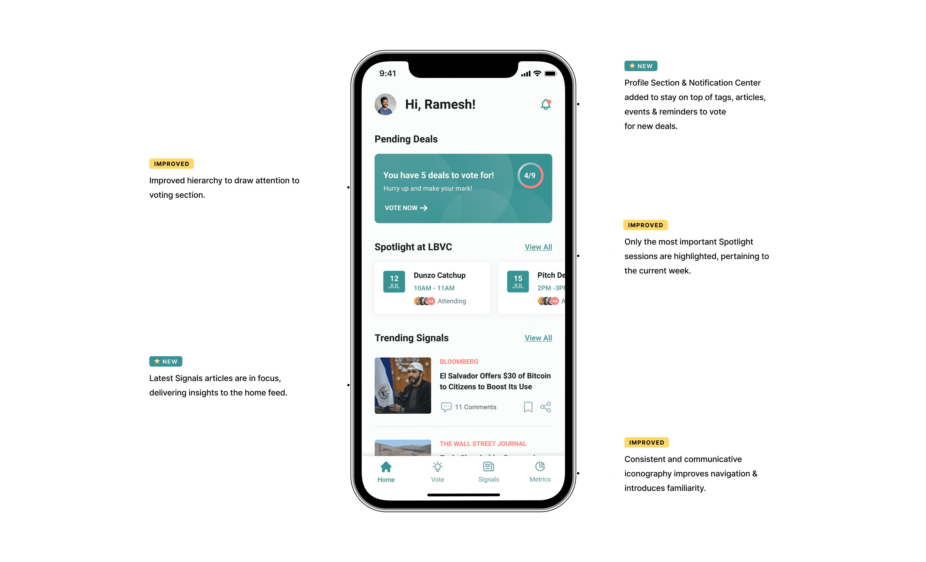
Home Screen
Home Screen
As part of our revamp of the homescreen, we improved the hierarchy of sections on the screen, with most visual attention being claimed by the persistent voting indicator card. If there are no deals to vote for, the indicator card will redirect users to the leaderboard.
Part of the redesign included adding additional functionality, like the profile page & notification center on to the homescreen.
The New Homescreen
The New Homescreen
Spotlight Sessions
Lightbox calls their events/meetings/discussions spotlight sessions, and we decided to let the Spotlight page remain a sub-page of the home page, because the frequency of spotlight sessions was not high enough to warrant a separate tab in the navigation.
We split the page into an upcoming section, and a past meetings section.
Upcoming meetings is split into a day by day list of events, up to one week, which are more relevant to the user within that work week.
Past meeting cards contain notes (recaps of meetings) so people who’ve missed meetings can catch up.

Spotlight Pages
Spotlight Pages
Voter Screen
Voter Screen
The voting process
The voting process

A major issue with the voting screen was the lack of organisation of information into cohesive chunks. There was too much information for a user to vote, and that was causing information overload.
Further, each pitch was a full screen, and swiping the screen left or right moved from one pitch to another.
We decided to represent each pitch as a card (ie a simplified pitch) with only the important metrics. Clicking on the card takes the user to an expanded view where information was chunked
We decided to gamify the voting process, by introducing a leaderboard.
We decided to gamify the voting process, by introducing a leaderboard.
Every user would have a score calculated using their voting behaviour, which would give them points on the leaderboard and boost their intrinsic motivation to vote.
This added a spirit of competitiveness & encouraged users to be more vocal in the voting process.
Every user would have a score calculated using their voting behaviour, which would give them points on the leaderboard and boost their intrinsic motivation to vote.
This added a spirit of competitiveness & encouraged users to be more vocal in the voting process.
Signals
Signals
The Signals screens included all the functionality that Lightbox had requested from the redesign, as well as additional features we added personally, like the ability to add areas of interest and the personalised feed. That customisability is further enforced by a sort button, and a filter button to filter news by industries or verticals.
Further, on the previous version of the app, news and papers had to be downloaded onto the app with each use. I suggested the use of the browser webview within the app, that reduced network constraints.
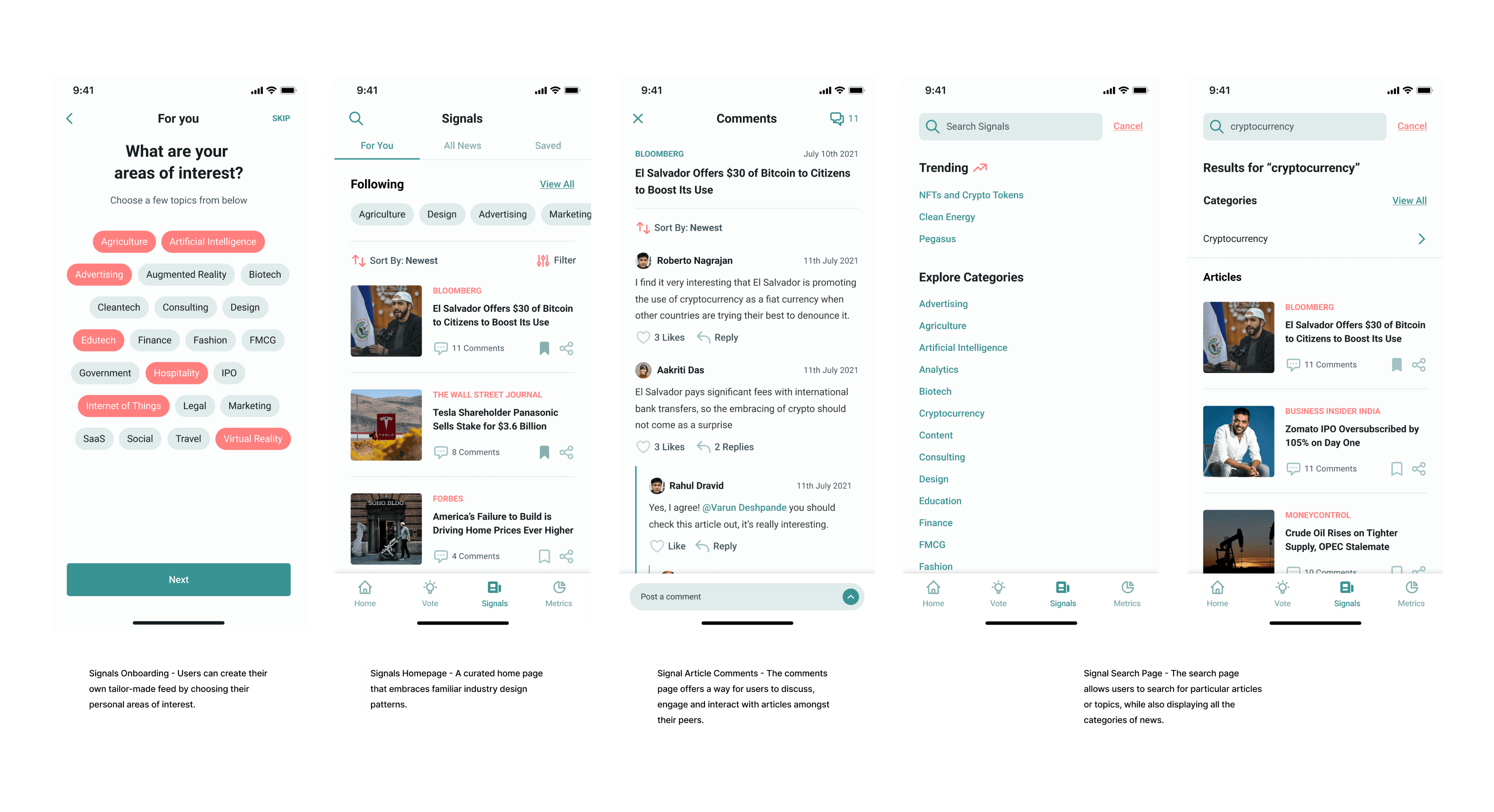
Signals Pages
Signals Pages
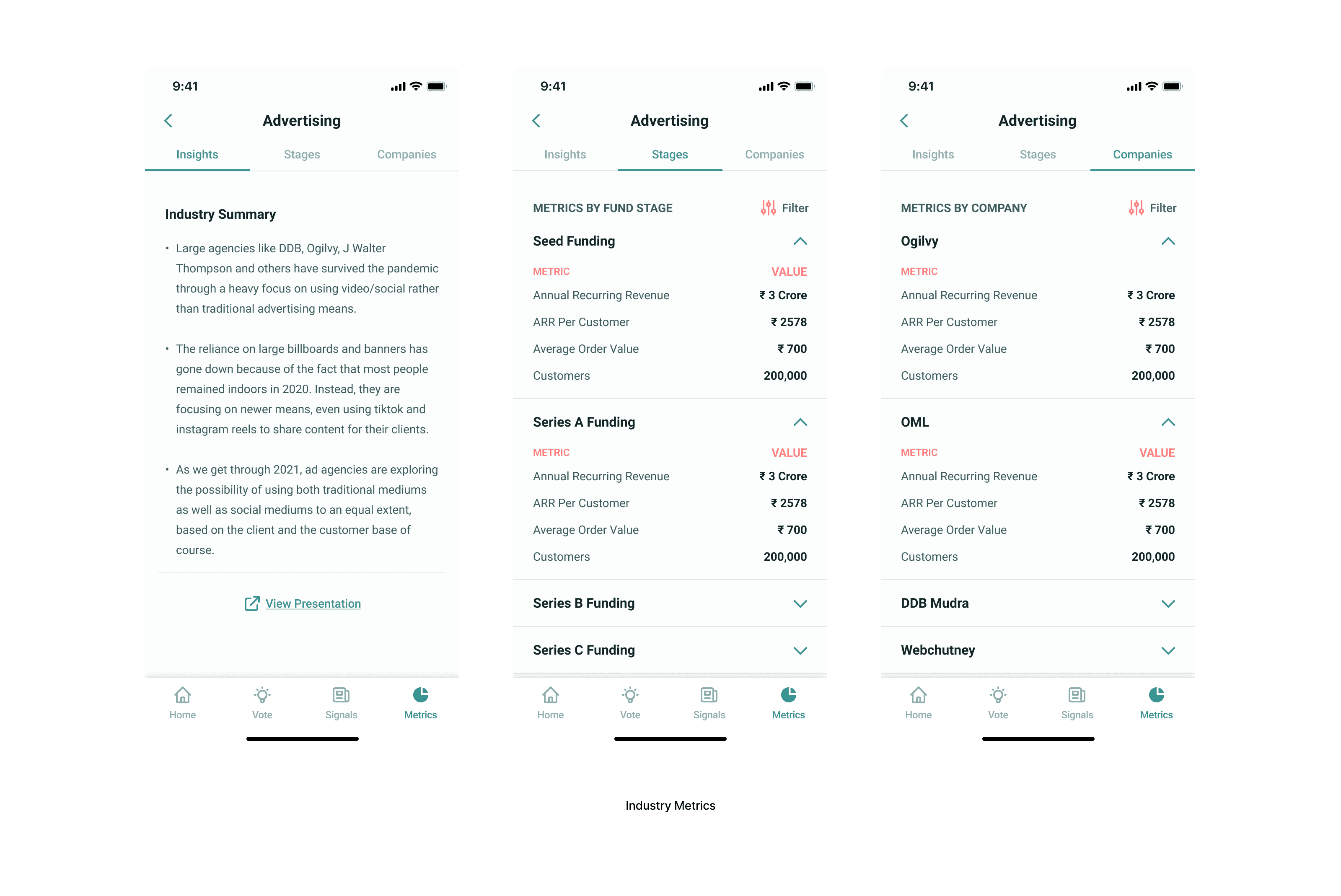
Metrics
Metrics
The app also contained a lot of metrics that pertain to various industries, their portfolio companies, and all the domains Lightbox keeps an eye out on. We split these into two pages, Industry Metrics and Fund Metrics (metrics on their portfolio companies).
The app also contained a lot of metrics that pertain to various industries, their portfolio companies, and all the domains Lightbox keeps an eye out on. We split these into two pages, Industry Metrics and Fund Metrics (metrics on their portfolio companies).
Industry Metrics
Industry Metrics
The goal was to keep it as simple as possible to consume at a glance, as more detailed information was available on Tableau or Excel datasets. For that reason, we let go of the complex data visualisations that were featured previously.
Earlier, industry data was categorised on the app by spaces, verticals and models. We suggested categorising data by the industry. After some deliberation with the Lightbox team, we came to the conclusion that we just needed to divide each industry into insights, fund stages, and by companies.
Fund Metrics
Fund Metrics
The fund metrics page just needed some UI spring cleaning, and we added note cards & a comments section so users could discuss every note.
The fund metrics page just needed some UI spring cleaning, and we added note cards & a comments section so users could discuss every note.

Final Outcomes
The app's improved UI that was designed on the basis of user feedback helped to deliver a seamless experience, which empowered users to actively participate in the deal flow making process. This helped them prioritise on the strategic decision-making in the deal flow funnel. The number of votes per deal improved through the redesign.
Additonally, the Signals section was far quicker to load and required less data overheads.
The comments forum on every article helped share data amongst various other users which festered a renewed sense of collaboration and team spirit.
Finally, the leaderboard gamified the deal flow process and helped to bring the Lightbox employees together, which improved the feeling of positive competition and team spirit, which re-iterated how important every single user/employee was in the decision making process.
On the whole, it was a pleasure working with Lightbox & getting a glimpse at how intricate and crucial venture capital is in backing the ideas of the future.